
01 · Fintech · Web product
Experiments on the credit card catalogue
The credit cards team ran 20+ experiments on pages with already strong conversion. I turned hypotheses into flows, carried them through launch, and helped the team decide what deserved to stay in the product.
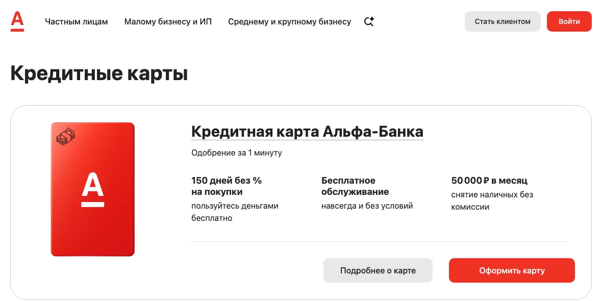
Case map
Four tracks of work
Two solutions improved CR1. One stopped after testing. Research fed the next hypotheses.
01 · Section
How we ran experiments
We worked to improve CR1: the transition from the website into the detailed application. We usually took one hypothesis, ran it for a month, and used the data to decide whether to keep it or drop it.
I owned the design cycle: clarifying the hypothesis with the Product Owner, designing the flow, working with editors, passing review, and checking the implementation before launch.
I liked this rhythm because interface debates quickly met real behaviour. Sometimes a small change beat a large concept.
02 · Section
“We recognise you”
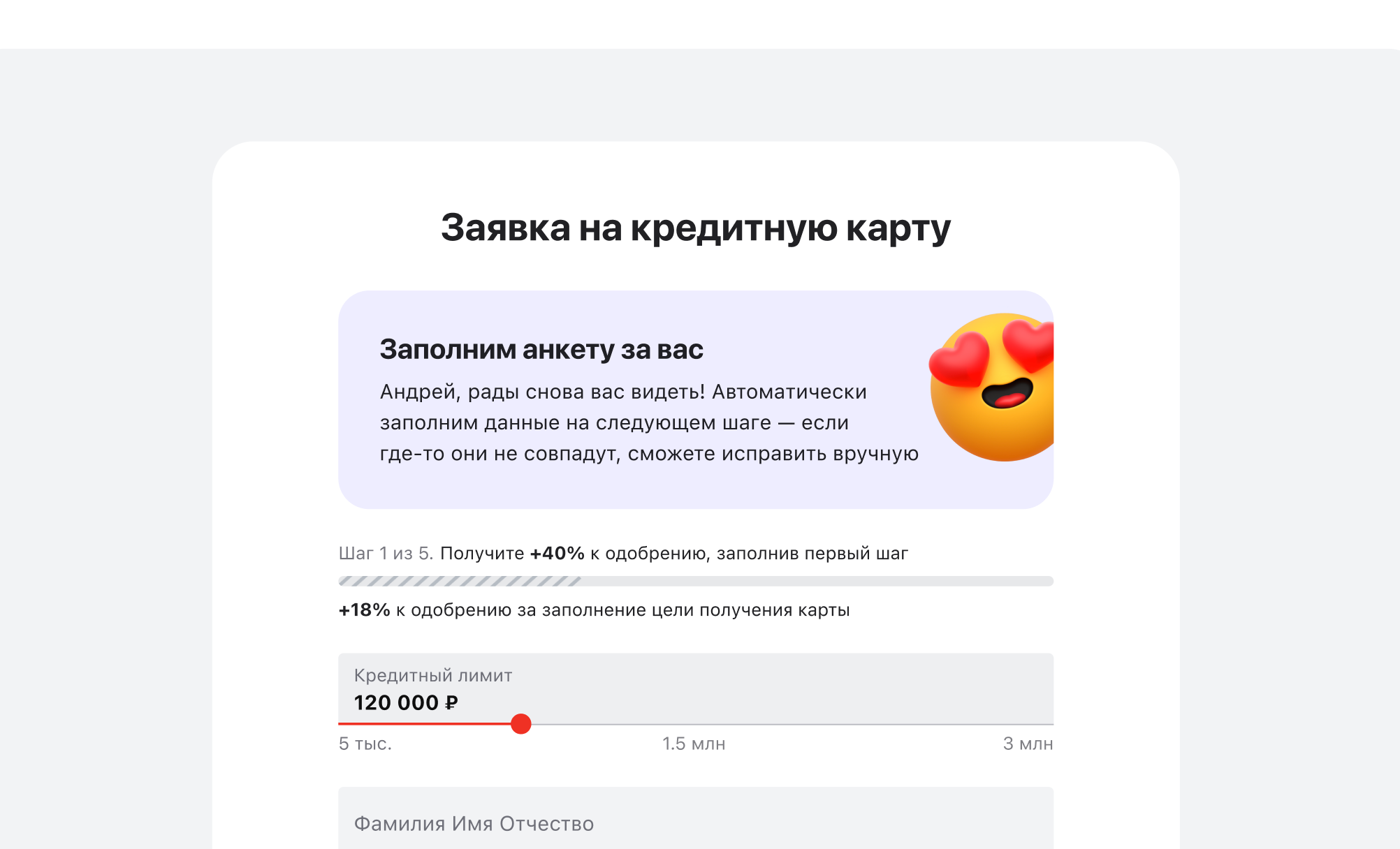
The bank could recognise some visitors and make their application faster. People could not see that advantage before they started.
We added a small notice promising a faster path. I prepared visual and copy options. Editors and marketing helped us stay attractive without promising more than the product could deliver.
The notice improved CR1 and stayed in the product. A small explanation beat a large new flow. That was a great result.
03 · Section
Start the application in the catalogue
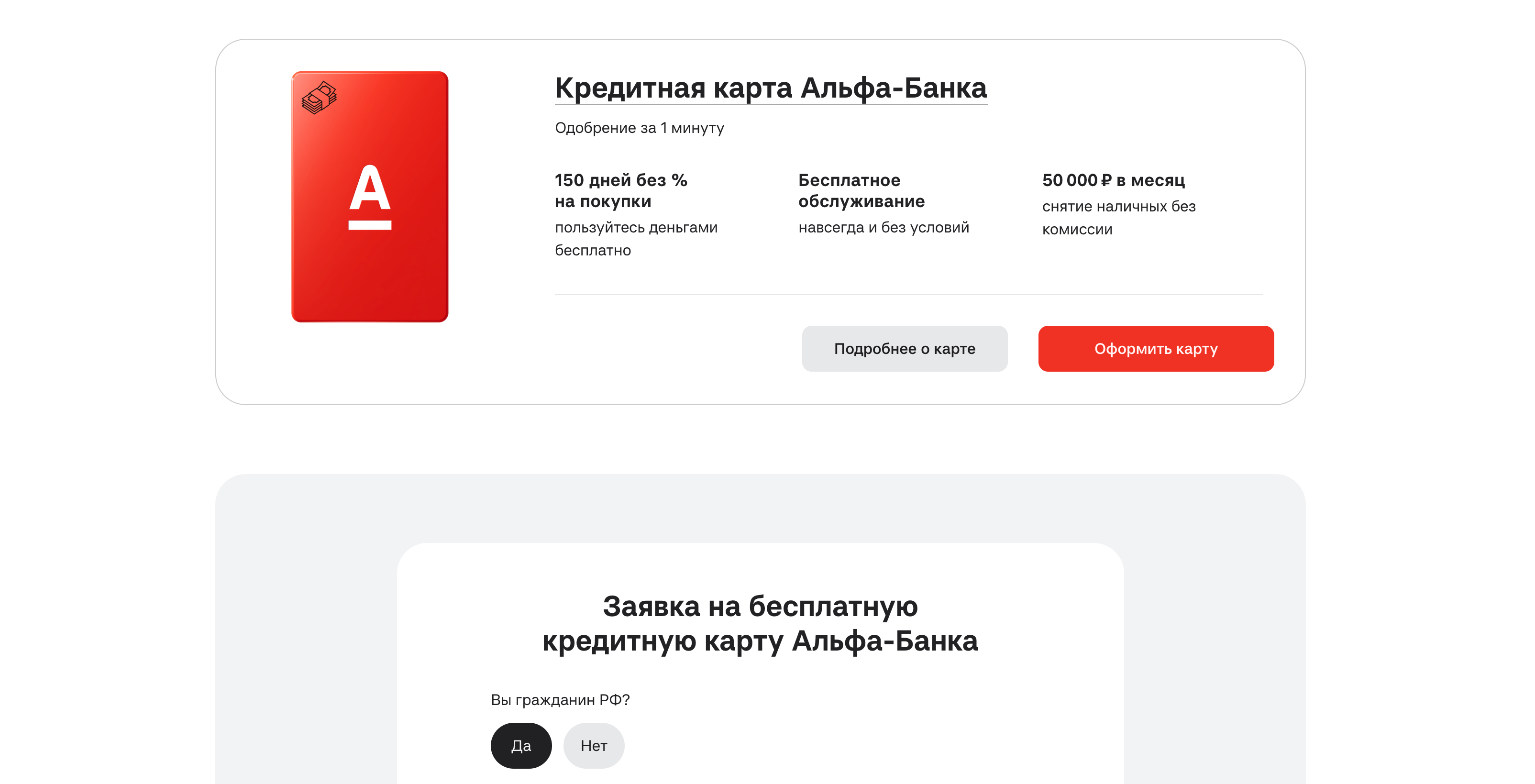
The catalogue helped people choose a card, but applying started on another page. We removed that break and placed the first step below the flagship-card offer.
The form could not be shorter: it already contained the minimum required for a credit product. I moved the complete flow, built it with the design system, and linked the card button to it by scrolling.
The experiment improved CR1 and stayed in the product. People started applying exactly where they had made their choice.
04 · Section
The most labour-intensive concept produced no uplift
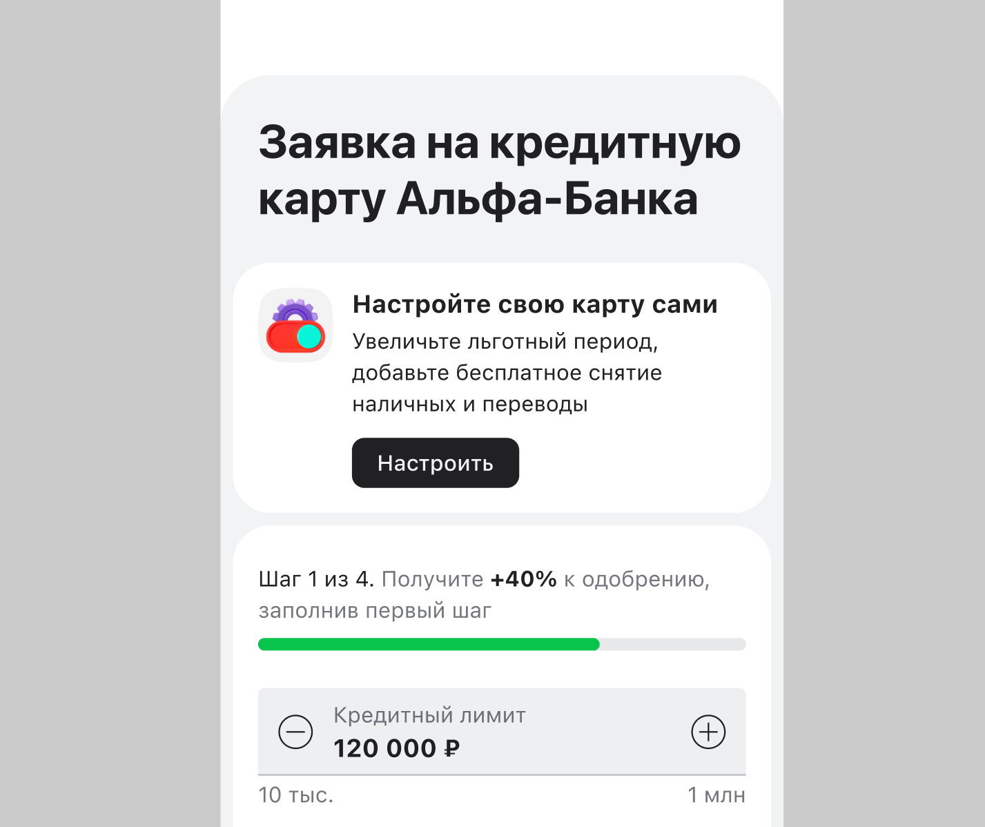
We built a fake-door configurator: visitors selected cashback categories while we tested whether personalisation would motivate an application.
For the ending, we considered a simulated error and an honest experiment disclosure. We chose disclosure, thanked people, and invited them to continue without the settings.
The concept was large, but the metric barely moved. We stopped. Sometimes that is exactly what a good experiment should tell you.
05 · Section
When the metric cannot explain motivation, talk to people
CR1 showed an application start, but not why someone needed a card. With the Product Owner, I ran 10+ interviews: I wrote the questions, moderated sessions, and synthesised findings.
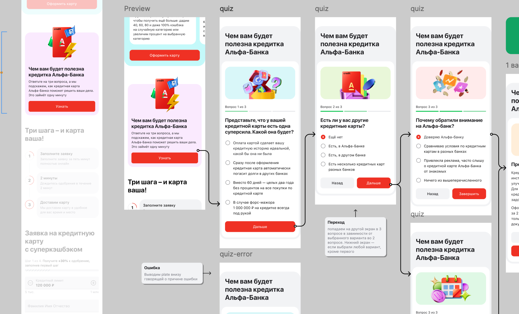
We then launched a quiz. Answers changed the final proposition: a need for a reserve, for example, became a financial-safety-net scenario. I designed the questions, branching, and interface.
We cannot tie the quiz to CR1 growth. Its value was direct material about customer motivations for later hypotheses.
06 · Section
What this series of experiments changed in my practice
The team ran 20+ experiments during the year. Two focused changes improved CR1 and, by the team’s estimate, noticeably increased monthly card sales.
My main lesson: strong product design is not a screen count. It is testing quickly, keeping what works, and dropping the rest without regret.